Spider-Man Develpment
General inspo and ideals
When drawing Spider-Man I tend to reference two of the most Iconic artists, Ditko and Romita Sr.


Very obvious picks I know but if you know my work you'd notice my tastes for the classic and original takes of a lot of these comic book characters, in other words, when characters like Spider-Man become public domain I will be golden.
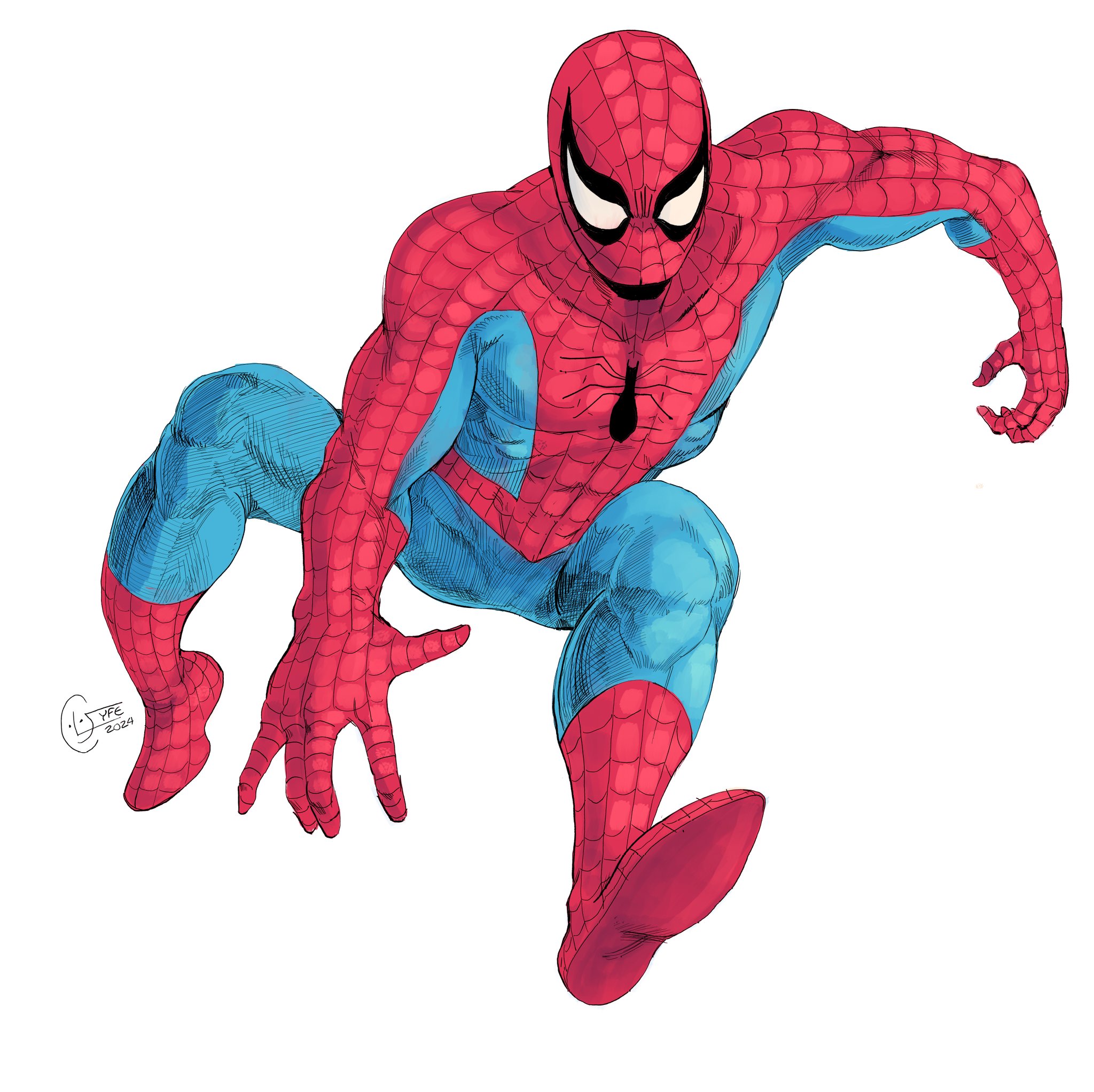


As you can see, my Spider-Man is a mixture between Ditko's creepy look and Romita's Muscles.
a certain thing to point out about the first two drawings I did here, the heads are too big, if you compare a lot of my character work I'm never consistent in terms of design, details or proportion, I am in a constant state of unsatisfaction and to be honest I need to nail down a definitive look which I hope to nail down this year of 2025.png) -but before 2025 or even 2024 we had this guy from 23!
-but before 2025 or even 2024 we had this guy from 23!
.png)
this I believe was the big starting point for my Spider-Man's look, especially for the eyes, with the thick upper lash.

I would like to also mention, one other thing that I never get consistent is Peter Parker's face, in the comics and also in my portfolio of work. I like making him handsome but on a full moon I make him more geeky.
I cant say the same for other characters like Superman, I'm often on the ball with him, but again rarely a modern look.

Development of the Blue Webbing
This post is a documentation of my thought processes when developing my Spider-Man drawings.
The initial idea of making a costume with webs on the blue came from wanting to redesign the NWH final suit, I think that suit is the best MCU Spider-Man suit but that's not saying much. since the previous few I'm not too fond of.

The Pattern already on the blue was a big inspo to start up the matching web visual.

a redux of the original image planted the idea of the web pattern, from trying to draw the MCU texturing I then developed that blue web idea.


It was then that I realised that the webs would look great on a general comic Spider-Man, rather than just a movie suit, I jamp at the idea and drew up these two.
notice how I draw blue on black to make a shine effect.

Personally, I like the idea of going into Spider-Mans more radioactive side, you can see that through the use of green.
I had also as you can see made it so the blue webbing is dark blue on top of a lighter blue.


I wanted to keep some of that shine effect from previous stages, so I made the blue webbing look almost netted/raised through highlights.
kinda like how JRJR's colourist raised red over the webbing,
the webbing is carved into the suit.

the webbing is carved into the suit.
As I said earlier in the post, these characters will be improved over time, not that Spidey looks horrible here.
just saying, he and many others will develop with my style and I'll also be sure to mock up some ref sheets for the main three going forward.


Comments
Post a Comment